By Holly Silvers | hollys@modelaircraft.org
As seen in the April 2026 issue of Model Aviation.
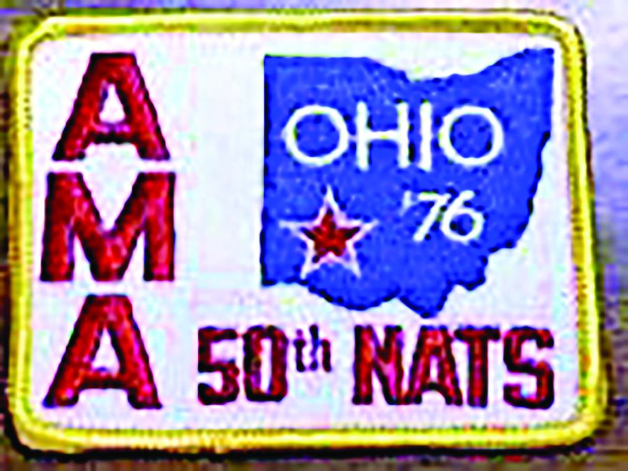
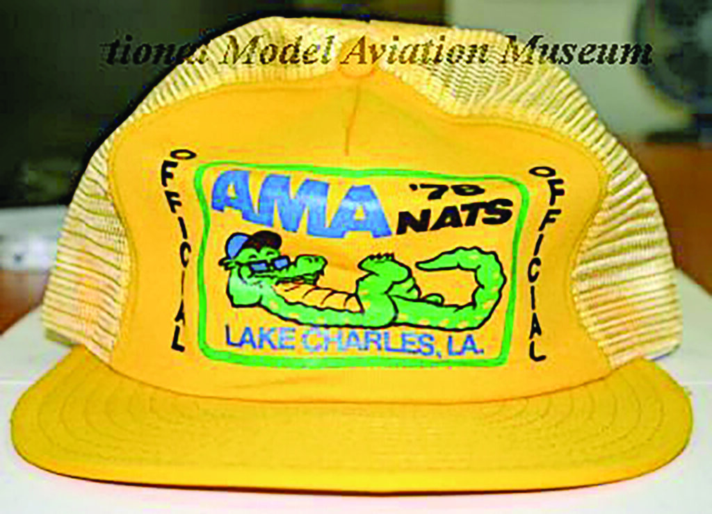
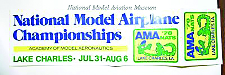
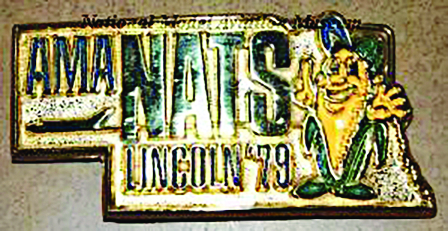
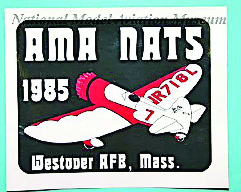
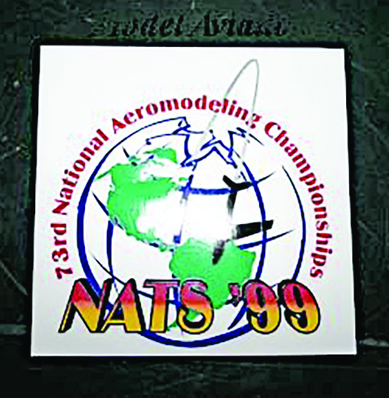
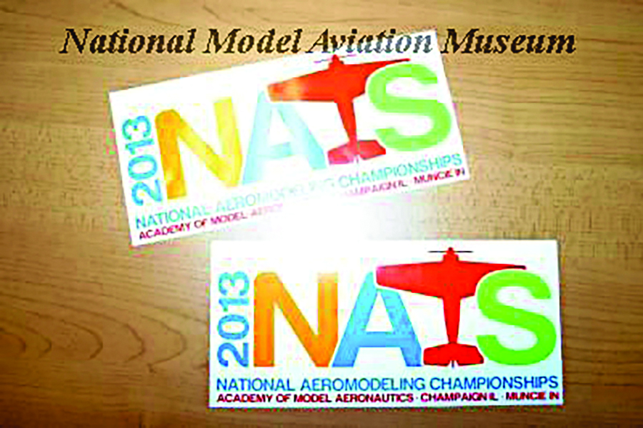
The Nats has been around for decades, and one of the easiest ways to see how the event has evolved over time is by looking at its logos. Each one reflects not only the design aesthetics of its era but also shows how the Nats were promoted and presented to the modeling community at that point in history. Changes in typography, layout, and imagery often mirrored broader shifts in both the hobby and the ways the events were advertised.
In the early years, when advertising consisted mainly of club newsletters, hobby magazines, and word of mouth, Nats logos were simple and practical. They were created to clearly identify the event rather than to establish a recognizable brand. During the years when the Nats were hosted by the U.S. Navy on its naval bases, the logos often took on a more formal look, influenced by military aviation and the setting in which the contests were held.
As AMA took over the event, the logos began to evolve along with the competition itself. Designs became more recognizable and consistent as advertising expanded beyond print to include programs, signage, merchandise, and, later, digital media. Today’s Nats logos are designed with a wide range of uses in mind, from websites and email campaigns to social media and event apparel. Looking through the logos shown here offers a quick visual history of the Nats—and hopefully gets you excited to attend this year’s Nats competition.
SOURCES:
2008.05.155, 2006.02.02, 2006.05.147, 2004.41.48, 2011.05.10, 2008.05.147, 2005.21.08, 2005.02.39, 2009.05.34, & 2013.05.03
National Model Aviation Museum, Muncie, Ind.